News: Northern New England
Posted: February 6, 2014
Harriman designs $46 million Maine cleanroom manufacturing facility for Mölnlycke Health Care
When Mölnlycke Health Care, a global manufacturer of long-term wound-care products headquartered in Sweden, wanted to expand into the U.S market, Harriman Architects + Engineers, was chosen to make their vision for a new $46 million facility a reality. The company selected Brunswick Landing, the former Brunswick Naval Air Station, as the plant's location because of its proximity to Rynel, a Wiscasset-based Mölnlycke subsidiary. The new facility was built by PC Construction and opened for production in September.
The 79,800 s/f facility houses a clean room production area, two-story office wing, and a warehouse. The exterior skin is comprised of aluminum sandwich panels in a variety of textures and colors, and the inviting curtain wall façade is punctuated with a bold entrance leading into a vibrant two-story lobby. Once inside, a viewing walkway provides visitors a glimpse into the manufacturing area.
Rigorous cleanroom standards. The cleanroom area is designed to rigorous ISO level 8 standards - 100,000 particles of micron 0.5 size per cubic foot - and mechanical systems are designed to meet these standards The ISO 8 level environment requires pressure mapping of clean to dirty spaces, tight temperature and humidity control ranges, pre and final air filtering, and a stratified air flow delivery system that maintains a laminar air flow and particulate control from the ceiling area of the 28,000 s/f cleanroom to the low returns located around the base perimeter. Harriman designed system redundancy so that all criteria could be met while routine maintenance is performed. Heat recovery ventilation and heat recovery from the various facility processes are captured and used for efficient heating and reheating of spaces or airflows. The cleanroom also features a walkable ceiling that segregates mechanical and electrical systems from the space for ease of service and further protection of sensitive production processes.
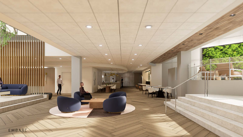
Maximizing natural light. Mölnlycke wanted a space that maximized natural lighting where possible, that provided a sense of place, and also acknowledged the company's European aesthetic. Clean lines and warm materials provide a European feel to interior spaces. Skylights at the second floor office area along with south facing windows bring in light. Using a light color pallet with occasional bold strokes of color, Harriman was able to make maximum use of reflected natural light to create the light and airy work environment.
The Mölnlycke logo - an "M" comprised of green globes - created a design opportunity. Using curved sofas and work surfaces as well as globe-shaped occasional seating to contrast with the rectilinear elements of the architecture provided drama. A custom light fixture over the lobby stair uses a replication of the "M" logo to provide a focal point in the dramatic two-story lobby. Finally, the building layout, systems, and structure are designed for easy expansion.
With this new space, Mölnlycke has underscored their commitment to the North American market with an efficient facility that honors their corporate ethos and looks to the future.
Tags:
Northern New England
MORE FROM Northern New England
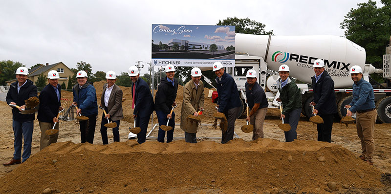
PROCON and Hitchiner break ground on 57,000 s/f shared services operations facility
Milford, NH Hitchiner, in partnership with PROCON’s integrated design and construction team, has officially broken ground on a new 57,000 s/f shared services operations facility at its Elm St. campus. This building will house value-added services used across Hitchiner’s various business units,

Quick Hits


