News: Construction Design & Engineering
Posted: December 20, 2012
Erland Construction completes renovation of 18,942 s/f headquarters at 71 Third Ave., Burlington
In early 2011, Erland Construction was making plans to find a new home. The lease on the building we had occupied for the last decade was expiring in March 2012. As we began to think about what we wanted for our new workplace, we realized that we had a great opportunity to reinvigorate our brand - Erland was going to celebrate 35 years in business in 2012. We couldn't think of a better time to launch a new brand identity and design our new space to reflect our updated positioning.
Soon after our search for a new corporate headquarters began, we decided that the 38,000 s/f building at 71 Third Ave. in Burlington was the best choice. Erland knew this building well - we built it out of the ground in 2001; renovated it for Acme Packet in 2004; and now, we would transform it from a single tenant building into Erland's new home on the 18,942 s/f first floor with space for a future tenant on the second floor. Maugel Architects, the architect for this building's previous projects, was brought in as the designer.
Synthesizing Our Look
With plans for the new office underway, Erland hired Boston-based kor Group, a brand strategy, design and new media firm, to guide us through our branding exercise. Together, we determined that an updated brand identity had to preserve what was integral to Erland's current identity while re-energizing the company's image - both internally and externally.
Erland's vice president of project development, Scott Bates said, "We wanted to be more relevant to a younger client base and at the same time confirm to current clients that we can still be relied upon to provide the level of service they have come to expect from Erland. And we wanted our new look to stand out in the marketplace, creating the kind of buzz that would help attract the best new graduates to careers with our firm."
kor Group reviewed Maugel's office design to determine ways the new corporate identity could reflect Erland's physical space. Both design efforts - architectural and brand - strove for a contemporary look and feel that was distinctive and energetic. Many ideas were considered, but ultimately these key components were incorporated:
* "Main Street" - the showpiece of Erland's new space runs the length of the office from front to back. It was designed to replicate the feeling of walking down a community street. Featuring glass storefronts and garage doors that disappear into the ceiling when opened, Erland's large conference room - with enough capacity to comfortably host the entire company for meetings - is situated in the center of this hallway.
* Exposed ceilings - several areas have exposed structural ceilings with raceways and ductwork that display how we coordinate the components within buildings we construct and also reinforce the contemporary feel we were trying to convey.
* Slanted/angled walls - the interior design of our new office incorporated many slanted surfaces to reflect those in the building's exterior design. We chose a slanted slash mark to accompany our logo as the information separator on our printed materials. Blue accent walls and brushed chrome architectural fins and signage letters again pulled the logo design into our space.
With the renovation and rebranding being done simultaneously and the end of our lease quickly approaching, the schedule was a primary concern. Once the direction of the new logo was established, the team made timely decisions to incorporate the appropriate colors and design elements. They completed the project in less than four months and the finished product is a beautiful place we're proud to call our new home.
Chuck Vaciliou is senior vice president/director of operations for Erland Construction, Inc., Burlington, Mass.
MORE FROM Construction Design & Engineering
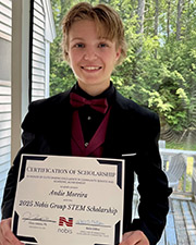
Nobis Group awards Robinson and Moreira STEM scholarships
Concord, NH Nobis Group, a 100% employee-owned consulting firm specializing in engineering and environmental solutions across the Northeast, has named the recipients of its 2025 STEM Scholarship: Andie Moreira of

Quick Hits
Columns and Thought Leadership

Careers in Construction Month focus on training and safety - by Joe Camilo
October is Careers in Construction Month, and rarely has it been more consequential. According to our chapter’s national parent organization, the construction industry needs to attract half-a-million new workers in the coming year to meet demand. Addressing that need is a huge job, but we at ABC MA are trying to do our part.

The rise of incubators and co-working spaces: The latest in life sciences - by Matt Combs
In recent years, the life science industry has witnessed a shift in how companies operate and innovate. One of the key driving forces behind this transformation is the emergence of incubators and co-working spaces specifically tailored to meet the unique budget and schedule needs of startups.
Ask the Electrician: Is summer a prime time for commercial electrical maintenance?
The answer is “Yes!” While January marks the official new year, many businesses view September as a fresh start. This makes summer an ideal time for commercial property owners to schedule long-term electrical maintenance projects.

The design-build advantage: Integrated interior design solutions - by Parker Snyder
When it comes to corporate interior spaces for both commercial and industrial projects, partnering with a design-build firm with in-house interior design services can offer clients many benefits. Unlike traditional delivery methods where interior designers operate independently from the design and construction teams, often creating a longer project timeline as cost negotiations and revisions ensue


